Comic Book Industry Logos – What’s in a logo?
“A product can be quickly outdated, but a successful brand is timeless.” – Stephen King

 What’s in a logo anyway? Well there are several things in a logo actually. Marketing will tell you that with a catchy logo, a person won’t soon forget your brand. Marketing also will tell you that once you’ve reached the pinnacle of your company’s success you wouldn’t even have to include your name on your logo. Sometimes the Image of your brand includes the name, but what if you took out the name? Would consumers or the normal average everyday person recognize your Brand? How about if someone described the logo, say for instants; a “swoosh”, “golden arches”, “A red tongue” ….you get the idea. These brands are so identifiable that a toddler will tell you when you’re coming up on a McDonalds while you’re driving.
Why are we discussing Logos and Brand’s? Well recently if you haven’t been living under a rock, DC Comics released their new company logo. Good, bad or indifferent, this is it. Once a company of this magnitude puts out 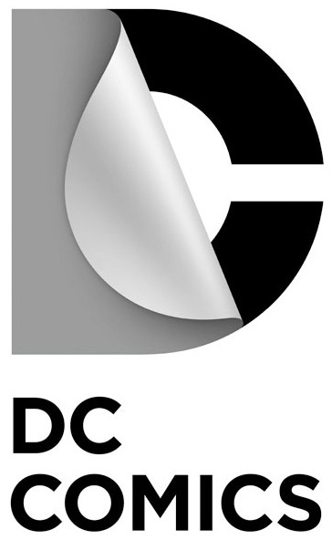

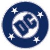
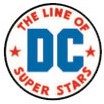 their new logo design, there isn’t much wiggle room for “take backs”. Over the course of the last 38 years or so DC comics has changed their logo 4 times. Overall changes since 1940 about 9 times. So what do you think of DC Comics new logo? Many of the knee jerk reactions have been negative ones. It’s basically like this folks. If DC Comics continues to put out a plausible product, the logo isn’t going to mean much. The identifying of the new logo will come in time. It probably won’t matter in a few weeks, months, years, because they may change it again anyway.
It does seem all of a sudden with the relaunch and the new logo that DC Comics is trying to reestablish their place in this competitive market. The new 52 got off to a rousing start, the tailing off is beginning with cancellations, but replacing with new titles. DC Comics will not stand still and produce a failing book. Odd isn’t it? Do they expect EVERY book to meet certain numbers now? What is that cut off number? Does one have to fear getting into a new title because of the quick ax that DC has now? Well that’s a discussion for another day…..
DC Comics has done it. They reinvented their logo. Since the inception of DC Comics, their logo has been very easy to Identify. Not so much the case with the new one, but as said earlier all of the moaning/groaning will die down and the logo will be the least of their problems. It all comes back to the product. DC will be DC, Marvel will be Marvel, and so forth. At the end of the day, they know where their bread and butter lie. The Superman, Spider-Man, Batman, and the X-Men’s are the core of what drives them. Good storytelling, great eye appeal, and stirring the hyperbole will keep the big 2 and the independents going. Changing a logo won’t break a company and it certainly will not break DC.
 So what is in a logo? Take a look at some of the comic book industry logos below and see how many you remember. Many are out of business, some are still here, some are pretty, some are awful, some have you scratching your head, some you wish were still around…….
Do you have any logos you’d like to share that aren’t here? Share them below in the comments section or on InvestComics’ Facebook page right HERE.
-Jay Katz
[nggallery id=79]