Alien vs. Captain America #4 cover by Leinil Francis Yu
This cover works because it understands restraint, something crossover books usually forget five minutes after the logo goes on. Leinil Francis Yu stages this as a pure confrontation piece, almost symmetrical, stripping the scene down to its rawest idea. On the left, the Xenomorph is all teeth, saliva, and curved menace, its elongated skull angled forward like a weapon that already knows it’s going to be used. The open mouth, dripping and alive, feels invasive even before the attack happens. On the right, Captain America is equally aggressive, teeth clenched, face turned forward, not retreating an inch. There’s no shield, no action pose, no movement beyond the tension between the two faces. Yu lets the white negative space do the work, forcing the reader to focus on the clash of ideals as much as the clash of characters. This isn’t “who would win,” it’s inevitability versus resolve. The torn-paper design at the top reinforces the idea of worlds colliding without apology. It’s a cover built for collectors who appreciate iconic standoffs rather than splashy chaos, and that’s exactly why it sticks.
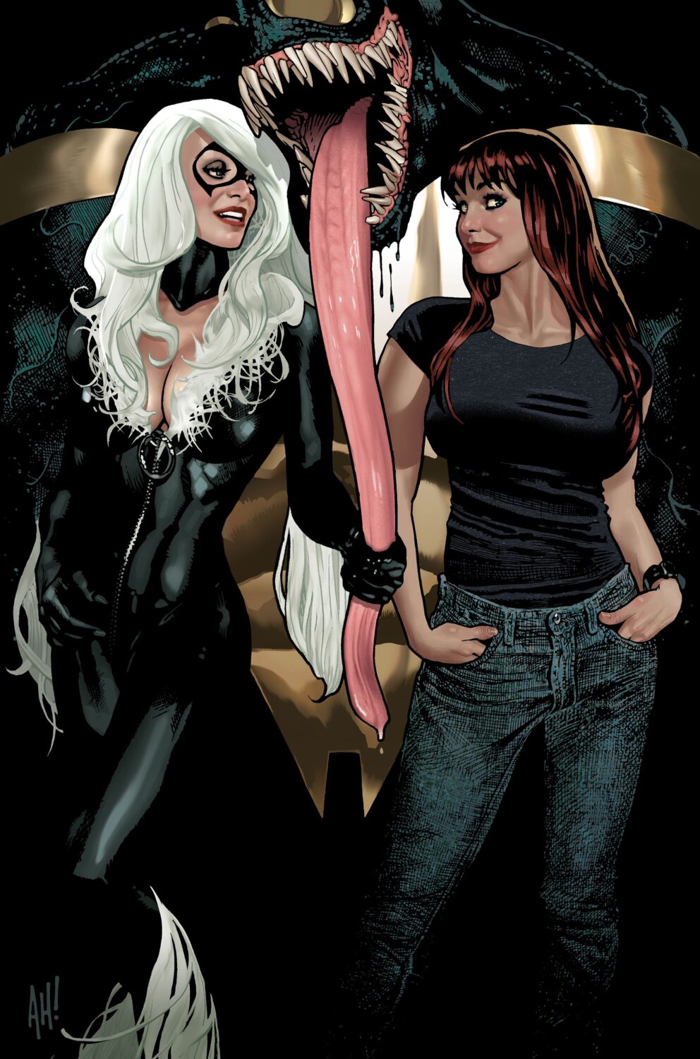
 Black Cat #7 cover by Adam Hughes
Adam Hughes delivers exactly what collectors expect from him, and he does it with the kind of casual confidence that only comes from decades of control. Black Cat is front and center, relaxed, amused, and fully aware that she owns the moment. The composition leans heavily on character chemistry rather than action, with Felicia Hardy and Mary Jane Watson sharing the spotlight while a massive Venom looms behind them, mouth open, tongue extended in a way that’s equal parts threat and visual punchline. Hughes uses body language masterfully here. Black Cat’s posture is confident and playful, while Mary Jane’s expression reads unbothered, almost curious, like she’s seen worse and isn’t impressed. Venom’s scale and placement should dominate the image, but Hughes flips the power dynamic, making the monster feel like background noise compared to the personalities in the foreground. The lighting is clean, the colors are warm, and the entire piece feels timeless in that classic Hughes way. This is the kind of cover that doesn’t need context or story beats to matter. It’s about attitude, character history, and the collector appeal of a creator doing what they do best.
Cover Gems of the Week: Power, Presence, and Confrontation
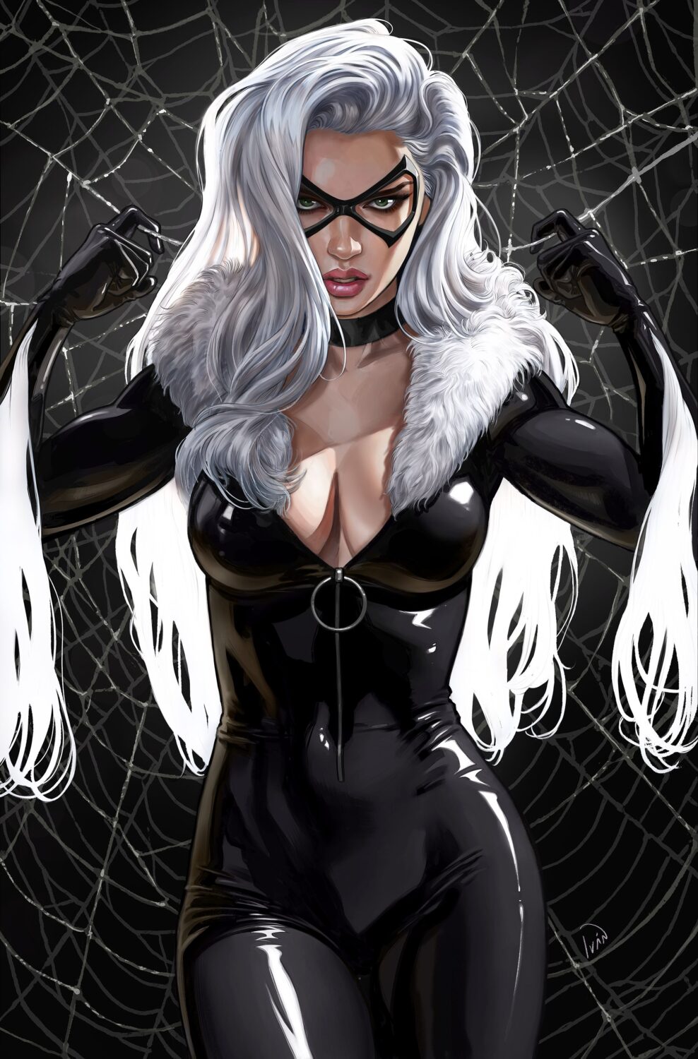
Black Cat #7 cover by Ivan Talavera
Ivan Talavera takes the same character and pushes her in a completely different direction, leaning into intensity and presence rather than playful interaction. Black Cat fills the frame here, powerful and confrontational, staring straight out of the cover like she’s daring the viewer to look away first. The glossy black suit is rendered with hyper-detailed highlights, giving it a sleek, almost liquid quality that emphasizes both strength and elegance. Her white hair frames her face dramatically, contrasting sharply against the dark background of webbing that feels claustrophobic and deliberate. Talavera’s Black Cat isn’t smirking or teasing, she’s focused and dominant, fists clenched, shoulders squared. This is a cover about control and confidence, not flirtation. The symmetry, the lighting, and the tight framing all work together to make this feel like a statement piece rather than a narrative moment. It’s a modern pin-up done with seriousness and polish, and it speaks directly to collectors who chase strong character visuals and artist-driven variants rather than story relevance alone.